This is the production schedule logging the progress of the construction of the trailer, film magazine front cover and the Hangman film poster along with my final evaluation:
This is the evaluation for my A2 Media Coursework. If you have trouble viewing the embedded video, click here to go straight to the evaluation web page.
This is my finished marketing campaign for our film, Hangman:
Trailer
Film Magazine Front Cover
Poster
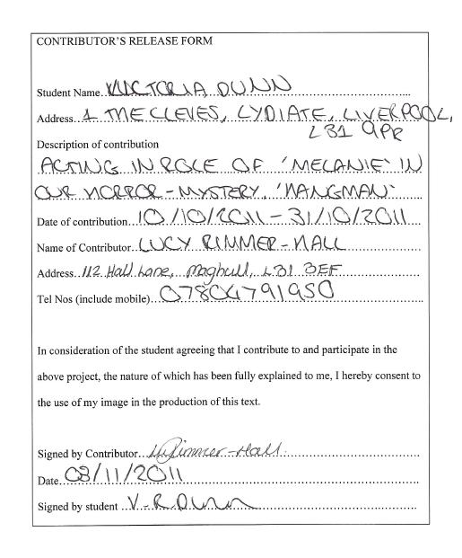
The main feature that links all three components together is the distinct 'cracked' font used for the film title on the front cover, the film title and release date in the trailer and the title, taglien and release date on the poster. In addition, the tagline 'THIS IS ONLY A GAME' is reinforced throughout the whole marketing campaign - it is written on the poster and magazine cover, and is whispered at the start of the trailer and is repeated numerous times in the 'Eat Me, Drink Me' soundtrack by Marilyn Manson. Furthermore, the colour scheme helps to link the campaign together - the white and red fonts combined with the greyish blurred background and bright green eyes of Melanie is the same in the poster and the front cover - and the film title is always white, which connects it to the trailer as well. The last component that links the whole campaign is the imagery - Melanie (actress Lucy Rimmer-Hall) is the main character that is in constant use throughout the campaign, from appearing in most of the trailer footage and being the only character in the poster and on the magazine cover. It was important that I enforced Lucy's part more so than otehr characters for two major reasons. The first is obvious, with her being the central protagonist in the film and thus the most important one, and the other reason is because she is the most well-known actress in the film who has starred in the (fictional) British horror hit 'The Creeps' (as conveyed in the Actors List) and would be instantly recognisable to a horror-fanatical audience. Moreover in relation to the imagery, in both the front cover and poster Lucy is stood to the side so that we see the left-side of her face and body - which makes the images look quite similar when next to each other. However, the film magazine uses a medium shot of Lucy whilst the poster uses a long shot so that we can see the hangman book dangling limply in her hand also - this gives a variation to the images and makes both of them more unique in their own way, and this small variation allows the audience to have more of an insight into the mystery surrounding the film bit by bit and subsequently maintains their interest. The book plays a major part in the film and most of the trailer footage is based around Melanie discovering this mysterious book and the deathly hangman game-pages are flashed before each 'death scene' in the trailer. Another main feature of the trailer is conveyed in the front cover and the poster - the sinister black Hangman gloves. Since the only thing of the Hangman seen throughout this marketing campaign is these gloves, it creates a mystery to his (or her!) identity and becomes a sort of trade mark for our film - whenever the audience see the black gloved hands now, they will imediately associate it with our Hangman movie.
Overall, I think that the trailer, magazine cover and poster all have their own unique characteristics and differences but all noticeably link up to form the same marketing campaign for our film, Hangman.
Every production company uses at least one poster in their marketing campaigns - even low budget independent films like 'Four Lions' had one poster to help sell their film. When creating this poster, it was vital that the poster linked with the film magazine front cover and trailer in order to ensure that the audience recognised that the poster belonged to our Hangman film and that they could synergetically link it up for themselves when seeing the poster at a bus stop and then later seeing the trailer on their television. Like the magazine front cover, I took images of the main protagonist Melanie (actress Lucy Rimmer-Hall) and kept her as the main image on both the front cover and the poster in order to preserve this synergy. I actually used two different images I had taken and edited them to combine together since both photos had components that I wanted for my final product. So before photoshopping, the two individual photos looked like this:
And after photoshopping, I combined the image to create this finished movie poster:
As you can see, I have combined both images and altered them to create a completely new image. Firstly, I cut the gloved Hangman hand seen in the second image and copied it onto the first image, which I wanted to use as the basis of my poster. I felt that the hand looked perfect in the second image, but went completely wrong otherwise since Lucy was almost smiling (rather than appearing frightened) and the image overall looked too similar to the one I used on my film magazine front cover. The first image was similar enough to the film magazine cover that it would be recognisable to the Hangman marketing campaign, but not too similar that it looked exactly the same (I will explain the similarity and synergy through the trailer, film magazine front cover and poster in a later blog). Once I had cut the hand out of the second image, I enlarged it and made it contrast more so that it appeared more black and sinister. The hand is shaped like a claw, as if it is getting ready to grab Melanie around the neck and kill her brutally. I then altered the forestry background behind Melanie and the Hangman hand (like I did in the film magazine front cover) my changing it into a black and white colour and lowering the contrast so it appeared like a grey blur - as if Melanie's life is about to blur into nothingness once the Hangman's clawed hand reaches her neck. I then made the contrast on Lucy brighter and changed the colour of her eyes to a more innocent and natural looking green colour - the same as the magazine cover - in order to emphasise her innocence and make her and the black hand contrast from the bleak background and overall be eye catching to passers' by. The last thing I altered about the image was the hangman book Lucy was holding - the writing on the page didn't stand out like I had envisioned it and I believed that it needed to since the whole film revolves around the Hangman gloves and this very book. Therefore, I used the burn tool on photoshop to highlight the words 'THE HANGMAN IS COMING..' and the unfinished hangman drawing and game on the opposite page so that it became a stark contrast from the white page and will be a noticeable and sinister image to the audience.
Film posters will nearly always have six pieces of information on them - the film tagline, title, cast and production billing block, release date, film company logo and the certification rating. Firstly, I had looked at other film posters to see were they placed their film taglines - some placed them along the top of the poster, and others placed them directly under the film title at the bottom of the page. I felt that there would be too much text if the title, tagline and billing block were all at the bottom and the image would in comparison seem sparse if there was nothing striking at the top of the image, so I decided to place the tagline 'THIS IS ONLY A GAME' at the top. I used a bloody red colour associated with blood, gore, death and anger - four features that encompass our film completely and are associated with the horror genre. I also used the 'Cracked' iMovie font that we used in our trailer in order to reinforce this font being associated solely with our movie. At first, I was worried that the tagline would stand out too much and the audience would be confused as to whether that or the 'HANGMAN' title at the bottom of the page was the film title or not, but these worries dissipated when I made the 'HANGMAN' title in an even larger white font that seemed to stand out more than the smaller bloody-red font at the top of the page. Again, I used the same cracked font to reinforce the synergy between trailer, front cover and poster. Nearly every film poster has a cast and production billing block - they contain the names of the lead actors and important production figures that created the film. My billing block reads as follows:
'LIONSGATE PRESENTS A CONOR WYNN PRODUCTION “HANGMAN” STARRING LUCY RIMMER-HALL CHARLOTTE WESTALL WITH BENJAMIN JONES CASTING BY VICTORIA DUNN MUSIC BY MARILYN MANSON DIRECTED BY CHARLOTTE WILLIAMSON EDITED BY VICTORIA DUNN WRITTEN BY CONOR WYNN'
I used the structure adopted by most movie posters and started of with 'LIONSGATE PRESENTS', since that is the ident used at the start of our trailer. I then included the three members of our production team me (Victoria Dunn), Charlotte Williamson and Conor Wynn as various roles, even though we all took part in all positions needed to create our product. The names of the three main actors in our movie (Lucy Rimmer-Hall, Charlotte Westall and Benjamin Jones) was then included. At first I was unsure whether to include the three names of the major actors in our film in a more noticeable place on the poster, but I just felt that they didn't fit in anywhere on the poster and since Lucy Rimmer-Hall has starred in the main role in the major British horror hit 'The Creeps' (as conveyed in the Actors List') I didn't think it was necessary since she was already a recognisable figure to a horror fanatical audience. We also included 'MUSIC BY MARILYN MANSON' in this billing block since his song 'Eat Me, Drink Me' features as the soundtrack in the trailer and may entice a wider audience of fans of the singer. Next, I decided to place the cinematic release date underneath the billing block in a bloody red lettering the same (but smaller) to that of the tagline at the top of the poster. The release date in Halloween would give a more sinister and spooky aspect to the poster, and would be more rememberable than a random release day on some insignificant date. Although I have already established the release date, I chose not to put a specific release date (instead putting 'RATING TBC') since this poster has been created a year in advance of the film actually being released and would not yet have been rated in any other professional marketing campaign - some films are not rated until 2 weeks until the film is actually released. Lastly, I included the 'LIONSGATE' logo but altered it to match the bloody red colour of the tagline and release date. The logo is important in enticing film fanatics who have seen Lionsgate films before and would like to see any film that has been produced by this company.
Overall, I think my poster links well to my front cover and film trailer - the way in which they synergetically link will be discussed in one of my next blog posts.
Creating a film magazine with our Hangman movie being the main feature was essential in selling our film to the widest audience possible. I also had to ensure that the magazine cover, poster and trailer all linked in some way and that it was immediately obvious to the audience that these three components were all of the same marketing campaign. I took pictures of the main character Melanie (actress Lucy Rimmer-Hall) for the magazine cover and the poster since she is a well-known actress (as conveyed in the Pitch and Actors List), and edited them using photoshop. Here is how my original photo looked before I started photoshopping it:
And after spending a few days on photoshop, I transformed the image into this completed film magazine front cover:
As you can see, I have altered the original image in many significant ways. Firstly, I transformed all of the green forestry in the background (apart from the tree Lucy is clutching to) into black and white and lowered the contrast so the bushes and leaves kind of blurred into each other - black has connotations of death, evil and mystery, and this added with the blurred background (as if Melanie's life is 'blurring' away) encompasses the horror-mystery genre of our film completely. Secondly, I altered the brightness and contrast of Lucy and the tree in order to make her appear bright, young and innocent, and also make her stand out from the blurry black and white background. I further made the black-gloved Hangman hands stand out by making them more contrasting and darker to the greyish-looking background - the Hangman hands, in my opinion, were essential in linking the front cover, poster and trailer together since the film is called 'HANGMAN' and he (or she!) along with the hangman book is the main focus of all the sinister events taking place in the trailer. I did not include the hangman book in this cover because I thought that the words scrawled in the open book would distract from all the feature stories alongside the central image, and would make the overall front cover too busy and untidy. I lastly altered this original image by changing Lucy's eyes to a bright green colour that would stand out from the rest of the image, and match up with the green colours later used in making the magazine features stand out - I had decided at the very beginning that the colour scheme for this cover would be black, red, white and green for several reasons. Black was a dark colour that matched the horror-genre of this magazine perfectly, and this along with the red colour had connotations of death, blood and anger. The white would be a stark contrast from black, and this white colour against the black text box backgrounds would ensure that each individual magazine feature stood out. On the other hand, green has connotations of naturality and freshness - two characteristics that match the natural and clean-cut image of Melanie.
Now that I had finished editing the image, I had to start making it into a front cover of a film magazine. Firstly, I needed to come up with a magazine masthead (i.e. name of the magazine). The masthead needed to be short and catchy - a word or two that made the horror film genre of the magazine completely obvious. After much pondering, I came to the title 'KILLER FILMS' - the 'KILLER' of course had connotations of death and brutality, and then 'FILMS' made the film orientation of the magazine even more obvious. The font I used coincides perfectly with the magazine title, as it looks as if a sharp object like a knife has slashed through letters in the name and the bloody red colour I changed it to adds to this gory ideology. Looking through other film magazine covers, I realised that nearly all of them had a strapline (i.e. slogan) under their masthead. For example, Empire's strapline is 'THE WORLD'S BIGGEST MOVIE MAGAZINE'. Therefore, I decided to create a strapline for my KILLER FILMS masthead with a horror orientation and wrote 'THE HORROR FANATICS MAGAZINE' under 'KILLER', and then put the date and price 'DECEMBER 2011 £3.99' under the word 'FILMS'. This masthead establishes the film genre of my magazine, whilst also establishing its house style. Now that I had made the masthead, I needed to illustrate the main feature of KILLER FILMS - our HANGMAN film. To connect this to the trailer (and poster), I print-screened the film title HANGMAN in the 'Cracked' font we used on iMovie, and then copied it onto the cover and edited it to make it smaller and sit alongside the image of Melanie and just above the sinister gloved hands of the Hangman. From now on, this font will be recognisable to the HANGMAN film. I then typed the film tagline 'THIS IS ONLY A GAME' and placed it under the film title, to again associate it with the whispered tagline at the start of the trailer and the soundtrack also used in the trailer were Marilyn Manson is heard repeating the phrase 'this is only a game' - everything from the soundtrack to the tagline is now synergetically linked. Next, I typed 'LUCY RIMMER-HALL TELLS ALL ABOUT THE GLOVED SERIAL KILLER WHO TAKES FEAR INTO THE NEXT LEVEL' and placed it inbetween the gloved Hangman hands in order to give a small insight into the idea of the film and entice horror fanatics with words like 'SERIAL KILLER' and 'FEAR ONTO THE NEXT LEVEL'. It is clear that the image links with the main feature 'HANGMAN' since the text is placed directly next to Melanie's fearful expression and is the only text that has a different font from the rest of the features, whilst the 'GLOVED SERIAL KILLER' coordinates with its placement inbetween the gloved Hangman hands. I have further promoted Hangman as being the main feature by placing a banner above the masthead reading 'EXCLUSIVE HANGMAN SPECIAL'. By using buzz words like 'EXCLUSIVE' and 'SPECIAL' in bold green text on a white background that stands out from the rest of the cover, it becomes immediately eye catching and the audience will be enticed due to the fact that this feature is exclusive to this magazine only and thus, will want to buy it.
Next, I needed to fill in the rest of the cover with other pugs and puffs giving insights into features in the magazine and enticing them into buying it. I created two pugs on the side of the magazine promoting other features to be seen in the magazine - I made the first few words of each feature larger and bolder as they were words associated with the horror genre and would be immediately eye catching for the audience. For example, in the feature 'GORE, GUTS AND GIRLS / THE INSIDE SCOOP ON HALLOWEEN III', the words 'GORE, GUTS AND GIRLS' was made bold red to associate with the gore of it all and the film title 'HALLOWEEN III' was also made bold since it was the film title, and important in enticing fans of that particular film franchise. This is the same for the other 'WORLD WAR Z' feature, in which the lead 'ZOMBIE WARS' was made large and bloody red for zombie fanatics and to associate with the gore of the zombie topic, and the famous names like 'MARC FORSTER', 'BRAD PITT' and 'WORLD WAR Z' was made red to stand out and entice fans of these particular directors, actors and films. I used another pug along the bottom of the page when writing 'PLUS! THE DARKEST HOUR, UNDERWORLD: AWAKENING AND THE INNKEEPERS' to give a quick list of other films discussed in the magazine and to attract the widest audience possible - the audience who are interested in these particular films. I took inspiration for this idea from both Empire and Total Film magazines, since they both seemed to do it and it is a clever selling technique. Next, I decided that I needed to finish of the selling devices for this cover by using two puffs - the first I created was a green and black stamp-like circle above the 'PLUS!' features and wrote 'HORROR POSTER SPECIAL'. The buzz word 'SPECIAL' in itself attracts the eye of the audience because it gives the impression that it is a free special feature that makes it different from other film magazines, and it is further made to stand out by being on a large stamp-like green background in a large bold white text. I find that it is the first thing my eye is drawn to when I look at the cover and thus, it immediately establishes the 'HORROR' genre and wins over the eye of the audience. I created a second puff just above the barcode on the right-hand side of the cover, and reads 'COMPETITION' (in bright bold green lettering which again stands out) ' TURN TO PAGE 9 TO FIND OUT MORE'. The 'TURN TO PAGE 9' is acting as an imperative, commanding the reader to turn to this page to have a chance at winning something. The majority of people love to have a chance to win something and will jump at the chance to enter before they even know what they would win! Therefore, this is a successful enticing device.
This is my completed magazine cover, and it links well with the poster and trailer through its common font usage and imagery.
The choice of soundtrack used in our trailer is vital - using the wrong type of music will send out a wrong message about the genre, storyline and overall atmosphere of our trailer. Therefore, we chose to use the following song:
Eat Me, Drink Me - By Marilyn Manson
As well as the distorted instrumental at the start of the song sounding eerie and strange and encompassing the genre of our film completely, the lyrics sang by Marilyn Manson themselves link perfectly to our storlyine. Lines such as "The trees in the courtyard / Are painted in blood" are quite morbid and connected to death, and thus connected to our 'death scenes'. Moreover, the line "This is only a game" which is repeated throughout the song connects to the Hangman book and gives a sinister feel to it being "only a game", and we will use this as our tagline thoughout our marketing process. We intend to have a person whisper "This is only a game" into the microphone on the iMacs and dub it in straight after the ident on our trailer, so then the audience will constantly get the messge throughout the trailer with the eerie whisper and the lyrics themseves. Therefore, this song is perfect as a soundtrack for our trailer.
Wooden Creaking - Sound Effects
Even though the sound effects used in this youtube clip are made from the creaking of wooden flooring, matched with the footage of an unknown character's limp form hanging it sounds like a tree or some other wooden structure that the character could be hanging from is growning under the weight of the dead body. This will be dubbed over this clip of the character hanging towards the end of the trailer, and the loud Marilyn Manson soundtrack will be silenced at this point so all the audience can hear is the creaking and groaning of whatever the character is hanging from. But dubbed over the top of this clip with the creaking wooden sound, we will also be dubbing in a dramatic 'dum' sound commonly used in film trailers for a dramatic effect - this way, the audience will recieve the full dramatic impact of the trailer. This creaking will bring the trailer to a disturbing end, and hopefully frighten the audience and give them goosebumps - thus coinciding with the horror aspect of our trailer. We intend to keep this creaking sound playing throughout the credits after the clip - credits slowly showing the film title, main actors and release date of the film. The silence added to this creaking will be terrifying for our audience. However, this quiet creaking will not be the end of our trailer - when the audience thinks the trailer is finally over as the wooden creaking ceases, there will be a sudden surge in loudness as they hear an earth-shattering scream dubbed over a clip of a character's terrified-looking eyes. This scream will be filmed through a microphone on the iMacs and dubbed over the clip afterwards. Hopefully, this quiet creaking in contrast with the blood-curdling scream will leave an impact on our audience and cause them to remember it afterwards and spread the word about our film.
All film production companies have an 'ident' - it is a short clip showing the company logo and it represents the foundations of the company as a whole. Our group needs to choose the right ident to match our 'Hangman' film, so I have therefore done some research into the various company idents in order to make a decision.
ColumbiaPictures
The Columbia logo has gone through many changes over the past 80 years and this is the most up-to-date ident, which was created in 1992. The model used for the woman carrying the torch was a housewife and mother of two, and the artist made her look like the traditional 'Torch Lady' with the draped dress and torchlight. There is one interesting aspect about the history of Columbia idents - it is not known who the original Torch Lady was! There have been multiple speculations - everyone from Bette Davis to small-town Texan actresses has claimed to be the lady in the famous logo. However, Columbia is not well known for its horror productions - notable films in Columbia's repertoire include 'Charlie's Angels', 'Stuart Little' and 'Spider-Man'. All of these films are either action or family films, and these do not coincide with our horror production. Furthermore, although the history of Columbia Pictures is extremely interesting, the bright golden lights and grand orchestral soundtrack does not convey any sort of horror imagery and thus does not represent our horror trailer successfully.
DreamWorks
Steven Spielberg wanted to reinvent the DreamWorks logo, and intended it to be reminiscent of Hollywood's golden age. The logo was originally intended to be a computer-generated image of a man fishing on the moon, but Effects Supervisor Dennis Muren has other ideas. Muren casted his own son William to model as the boy on the moon, and artist Robert Hunt painted both the real boy and a CGI version - but Spielberg liked the real boy William better. Ever since, William Muren fishing on the moon has been universally recognisable and is well-known for its animation productions, such as 'Shrek', 'Antz' and 'Madagascar'. Unfortunately, since DreamWorks is solely known for its family-friendly animation productions, it would be inappropriate to use it in our horror trailer since it does not coincide with the sinister themes in our production. Moreover, the orchestral music and the positive imagery of the boy fishing on the moon amongst the white clouds does not convey horror themes, and would thus not match our trailer at all.
Paramount
There is a story behind this distinctive Paramount ident - it is the oldest surviving Hollywood film logo, and has appeared in almost everything from home videos, cartoons and TV programmes to million-dollar blockbusters. The well-known Paramount mountain is said to be based on a doodle made by W. W. Hodkinson during a meeting with Adolph Zukor, from his own memories of the mountain ranges from his hometown in Utah. The soundtrack played over the top of the ident is a fanfare called 'Paramount on Parade', and was used in the ident after the film of the same name was released in 1930. The ident has gone over minor changes since its 1930 release, and the one shown above is the coloured version used in the 1992 film 'Wayne's World'. However, this ident would not fit in with our horror production since the stars, blue skies and picturesque mountain gives off a positive atmosphere more associated with family films or dramas. The music is also too upbeat and positive, which does not connect with out horror-mystery themes at all. Paramount is not even known for producing horror films - its most notable productions include 'Lara Croft: Tomb Raider', 'Zoolander', 'Rugrats in Paris: The Movie' and 'Iron Man' - all films that are either dramas, action, comedies or family films. Therefore, Paramount would be an inappropriate ident to use in our trailer.
Twisted Pictures
Twisted Pictures is actually owned by Lionsgate, and it sprung into fame after producing the first ever 'Saw' movie and has gone on to produce all of the following sequels. These films are the most notable in Twisted Pictures' repertoire, but they have had other horror-mystery projects such as 'Dead Silence' and 'Mother's Day'. The ident starts out with the seemingly-innocent 'Twisted Pictures' text, but suddenly barbed wire appears out of nowhere and coils around the text. A metal steak is then planted in between the two words, with the barbed wire wrapping around it and the steak turning to pull it tighter around the text. The wire twisting around the text and the steak turning to twist it tighter coincides with the company name, 'Twisted Pictures', and gives a disturbing and unsettling image mostly connected with horror films. After that, there is a sudden and unexpected flash of lightning and the barbed wire uncoils itself to leave lines on the text where the spiky wire cut in. This again relates to the 'twisted' imagery and conveys that the production company is obviously based around the horror genre. This would be a good ident to use for our film since it represents all of our ideals and principles for the film, but its only downfall is that this ident is not instantly recognisable - it is not as well known as other production companies, and would only be successful in attracting an audience if people knew that Twisted Pictures produced the infamous Saw films.
Lionsgate - Our Chosen Ident
'Saw' was the biggest money-making horror movie in history for Lionsgate generating $103 million at the global box office, and has since become renowned for its other horror projects. After the Saw films, Twisted Pictures (a spin off company owned by Lionsgate) was created and it has gone on to lead production in all of the following sequels. Horror films such as 'Hostel', 'The Descent' and 'My Bloody Valentine 3D' have come from Lionsgate's various film franchises. Since it has had so many horror films, Lionsgate has produced its own spooky ident to relate to the genre. The ident starts out with a faint thumping sound, and then a strange sound is suddenly amplified and we see (and hear) a load of cogs turning. The shot then zooms out to show all of the cogs working together, and then zooms out through a key hole to reveal a set of large doors. The doors then open to reveal the 'LIONSGATE' logo surrounded by a cluster of dark, red and black clouds. The imagery in this ident connects to the horror theme - all of the cogs are brown, red, black and golden colours that convey an ominous heated setting, and the cogs appear to be rusting and creaking giving off a sinister impression. This links to the dark, rusty golden doors that spring open to reveal the Lionsgate logo - this added with the sinister music is quite frightening since we do not know what is behind those doors, there could be something terrifying there! The Lionsgate logo surrounded by dark, red stormy clouds conveys horror, anger and heat and thus has connotations linking to hell - this of course adds to the overall horror feel, and would connect perfectly to our film. Moreover, the sinister background music and the sound of the clicking cogs gives off an eerie atmosphere and links to the scary imagery - the sound and imagery combined gives a horror atmosphere, and since it has produced well-known horror films it will fit perfectly in our trailer. Therefore, this is our chosen ident for our movie, Hangman.
When filming, we had many takes that went wrong. Here are some of the takes (shown on clapperboards) which we had to re-film several times before getting them right for our final product: (Please Note: The scene numbers and descriptions are in conjunction with those of the Shot List blog post-editing - they are not the scene numbers shown in the Running Order pre-filming or the storyboard)
This is a mock up of the poster of our horror-mystery film, Hangman. It is just a rough representation of what the layout would be:
I believe that the tagline would be most effective when placed at the top of the poster, in possibly a blood red colour to convey the horror genre of Hangman and to symbolise it's death theme. The picture of a hangman's noose will be placed in the centre and will dominate the enitre poster, relating to the "HANGMAN" title. The title would most likely be placed directly under the noose, and we are currently experimenting with title forms such as "H_NGMAN", to add to the hangman-game themes by missing out letters - but not so many letters that it would be unobvious as to what the film title was. This is all neccessary in creating a synergy that runs throughout the poster. Furthermore, the cast and production billing block would be in a dark colour that doesn't stand out too much and blends into the background, since it is insignificant to the audience. The cinema release date might then be in a red colour to match the tagline and film title, since it needs to stand as it is vital in informing the audience when the film will be in cinema. This along with the film website address may also be in red, as it is another essential part of advertising that will reach the widest audience possible. Lastly, the production logos will be small and in a dark colour that blends into the background, since it is again unimportant to the audience and just there to complete the overall professionalism of the poster.
The masthead (including the magazine name) will go across the top of the cover, in a bright colour that will define the house style of the particular magazine (be it Total Film, Empire or a magazine of my own creation). There will then be a banner above this masthead with buzz words like 'exclusive' or 'special edition' to make the audience want to by the magazine due to its exclusivity - this, along with all other text on the page, may be in colours that match the colours used in the image to create a synergy throughout the cover. The typical magazine features will obviously be included on this cover for professionalism - the dateline and price will be placed in small, discreet writing just under the masthead, and the barcode will go in the bottom right-hand corner. Next, there will be a long pug-column on the left-hand side giving readers an insight into other main articles discussed in the magazine - another device used to attract readers into opening the magazine to find out more about these exciting features. Then there will be space at the bottom of the cover to include a 'PLUS!' space, giving the names of other movies discussed in the magazine to attract the widest audience possible. For further enticement, I will include a puff on the right-hand side of the page advertising an exlusive feature or competition that can only be found in this magazine, in order to attract potential buyers. Lastly yet most importantly, the image showing the feature story (Hangman) will be the background of the whole cover, with all text and the large bright title of this feature overlapping it. I feel that all of these components will make my cover the most effective it could possibly be.
Our group decided that we would attempt to get all of our filming completed in nine days, so that we could gather enough footage to start editing as soon as possible. But before filming, we created the following production schedule in order to organise when our media group and actors were free for filming, since we all had various commitments (e.g. jobs) that prevented us from picking random times to do the filming:
This is a spreadsheet of the hours in which we would spend filming in each different location. The colours coordinate with the locations as following:
Saturday 8th October, 10am-5pm (Yellow) - Filming four death scenes in the house on The Cleves in Lydiate. We will film the 'KNIFE', 'FALL', 'TRAPPED' and dragging death scenes
Sunday 9th October, 2pm-4pm (Green) - Filming the Tara bathroom scene (where pink lines appear on her wrists and neck) in the house on The Cleves in Lydiate
Monday 10th - No filming
Tuesday 11th, 4pm-5pm (Blue) - Filming 'SUFFOCATE' death scene in the Blundell building in Deyes High School
Wednesday 12th, 11am-5pm (Purple) - Filming in park on Sandy Lane, Lydiate
Thursday 13th, 10am-1pm (Orange) - Filming in park on Seymour Drive, Lydiate
Friday 14th - No filming
Saturday 15th, 7pm-8pm (Red) - Filming 'FIRE' death scene in fireplace in house on Sandy Lane, Lydiate
Sunday 16th, Noon-2pm (Grey) - Filming 'RUN' death scene in underground subway tunnel in Maghull
Daily Planning - Props, Actors, Costume and Equipment Needed for Each Day of Filming Saturday 8th October
Props - Knife and Hangman gloves
Actors - Emily Oakes, Conor Wynn, Charlotte Williamson and Victoria Dunn (me!)
Costume - All above character's costumes (as shown in the Costume List) are needed
Equipment - Camera, camera charger and lead to attach camera to computer
Sunday 9th October
Props - No props needed, location has everything required built-in (i.e. sink and mirror)
Actors - Charlotte Westall (Tara)
Costume - Tara's 3rd costume choice (as shown in the Costume List), and red lipstick to draw realistic-looking red lines on Charlotte's wrists and neck
Equipment - Camera, camera charger and lead to attach camera to computer
Tuesday 11th October
Props - Hangman gloves and white suffocating cloth
Actors - Conor Wynn
Costume - Conor's costume (as shown in the Costume List)
Equipment - Camera, camera charger and lead to attach camera to computer
Wednesday 12th October
Props - Hangman book and Melanie's school bag
Actors - Lucy Rimmer-Hall (Melanie), Charlotte Westall (Tara) and Benjamin Jones (Will)
Costume - Both of Melanie's costumes, Will's costume and Tara's 1st and 2nd costumes (as shown in the Costume List)
Equipment - Camera, camera charger and lead to attach camera to computer
Thursday 13th October
Props - Hangman book, prefect badge and Tara's school bag
Actors - Lucy Rimmer-Hall (Melanie) and Charlotte Westall (Tara)
Costume - Melanie's 1st costume and Tara's 1st costume (as shown in the Costume List)
Equipment - Camera, camera charger and lead to attach camera to computer
Here is a list of the props (along with photographs) required for our shoot. These props are essential in revealling the storyling to the audience and transforming Hangman into reality:
Hangman Book
The Hangman book is the most essential prop in our film - it is the basis of our whole storyline. Melanie finds this book under a bush in her local park, and she starts completing the missing letters inside the book. The majority of the book is now filled in as shown above, since these pictures were taken after filming, and words such as 'SUFFOCATE' and 'FALL' link to the sinister death methods that will be conveyed in our trailer. The book creates a sense of mystery (which coinicides with our horror-mystery movie genre) - is this book cursed by the mysterious Patricia Applegate student whose name appears on the front cover, or is it just the sick, twisted mind of an anonymous Hangman serial killer? This prop will make several appearances in our trailer, as we intend to have the completed Hangman game words flash on screen before each death scene. For example, the word 'TRAPPED' would flash on screen just before we see our death scene character Charlotte being locked inside a wardrobe by a ominous black-gloved Hangman hand. We created this book by finding an old school exercise book and scribbling sinister words such as 'KILL', 'HATE' and 'DIE' all over it along with the unfinished hangman games. We then soaked a tea bag in some water and dabbed it over all the pages throughout the book, to match the old-age of the book and the yellowing, withered feel we were trying to give it. After that, we wrote the name of the mysterious 'Patricia Applegate' ('Patricia' being a name used decades ago and no longer commonly in use, thus adding to the old-age feel) and tore/ripped several pictures to make it seem more overused and withered.
Hangman Gloves
Like the Hangman book, the Hangman gloves are a vital part of our trailer. These long, sleek black gloves will represent the Hangman, as they appear in almost every so-called 'death scene' in our trailer. The longness of the gloves will ensure that the identity of the Hangman remains anonoymous, and thus creates a mystery as to who this evil being could be. The colour black has several sinister connotations - evil, death and mystery - all aspects that identify with the Hangman exactly. Therfore, these black gloves are perfect in representing the Hangman as the ominous, harbringer of death that he (or she!) is.
Knife
This large, sharp knife appears in one of our first 'death scenes'. Although we never actually see it being used, we see the ominous black-gloved hands of the Hangman pulling it slowly out of a knife block in a kitchen, and immediately the audience will realise that the Hangman intends to use it on his next unknowning victim. It is a regular kitchen knife that would be used in everyday life in everybody's kitchen around the world, so we our turning an innocent kitchen tool into a devastating murder weapon.
Suffocating Cloth
This white cloth is used in the 'SUFFOCATE' death scene, and will be used by the black-gloved hands of the Hangman to suffocate the unsuspecting victim. It looks like a regular cloth that may be used to clean a table or dry some dishes but when used in our trailer, it has a completley different sinister use. Strangely, white has the connotations of innocence and goodness - yet the Hangman uses it for evil and suffering. Therefore, this white cloth could match the innocence of the Hangman's latest victim, but also represent how he (or she) is taking goodness into his own hands and twisting into something completley malevolent.
Prefect Badge
This prefect badge is used in the earlier scenes of our trailer - the scenes just telling the storyline of our film. Melanie is trying to pin this badge to her jumper but accidently drops it, and Tara takes the opportunity to swoop in and poke fun at "the perfect smelly melly". Tara then throws the badge far away, where it lands near some bushes. This is how Melanie discovers the Hangman book - her prefect badge lands right next to the bush where the book is sitting underneath. This prefect badge conveys Melanie's clean-cut and nerdy image, whilst playing a leading part in the finding of the evil Hangman book.
Melanie's School Bag
In the opening scenes of the trailer, we will see Melanie leaning against a fence rooting through this bag. It is mainly used to coincide with the characters age group (sixth form students) and give Melanie something to do whilst waiting for Tara and Will to walk past and shout insults at her. This prop links well to the location also - she could just be in the school field looking for something in her bag, whilst Tara and Will just saunter past mocking her. The bag further links to her geeky character - people her age would typically use on-trend leather bags or other fashionable alternatives, but Melanie uses a sporty-looking bag that would not be usually taken to school by people of her age.
Tara's School Bag
Tara's bag on the other hand, is big, overpowering and more stylish than Melanie's sporty bag. The size of the bag represents Tara's massive power over Melanie, and the sleek, stylish woman on the front encompasses Tara's character completely. This bag again coincides with the age of the characters and the fact that they are all still in sixth form school.